YouMind's Chrome extension has completed a fresh redesign, now reaching its fourth version overall.
Over the past year, we've iterated, refined, added, and cut features repeatedly. Looking back, it's more than just another version number, it feels like we've walked a meaningful stretch of road. So I wanted to document this journey and share some reflections with you about the story behind this extension.
The Foundation of YouMind
The earliest version of YouMind wasn't actually a web feature. It started as an extension.
I remember brainstorming the new project with Yubo at a coffee shop in Tianmu. I had my laptop and some rough wireframes, showing him my vision. That first version was an extension. We stared at that narrow strip of real estate on the left side of the browser, brimming with ideas and high hopes.
Two years ago, AI powered extensions were still rare, nothing like the flood we see today. Our goal was straightforward: assist with reading, summarize content, learn about authors, and provide timely related reading based on keywords. We had one core mission: help users capture key information more efficiently while reading. This idea became the bedrock of YouMind.
We talked up a storm about this extension because nothing quite like it existed at the time. We threw every "AI native" capability we could think of into the mix, trying to reimagine what reading could be. So we went to investors with high expectations and our concept sketches. Predictably, we got rejected or told we were being overly ambitious.
But those conversations weren't meaningless. In fact, they made the whole thing more real. Every chat with investors or firms added a new perspective. Some came from the user angle, others from business viability, still others from timing and risk. Gradually, we shaped what we nominally called version 0.1.
Dawn Rising
By 0.1, the extension had evolved beyond just an extension. It now had companion SaaS features. You can see we'd started fleshing out those initial ideas. At that point, we only had the YouMind name, no logo yet. I sketched a sunrise on the fly, symbolizing our new product rising in the East.
Looking back at the extension itself, you'll notice the core features haven't changed much from the final version. But back then, we'd dreamed up all sorts of clever touches that never made it into the actual product.
For instance, we once added something called the "Human Index." The thinking was: as AI evolves, more and more content will be AI generated, so how do you tell how much of an article was actually written by a human? So we wanted to add this index. Two years ago, it was a pretty fresh idea. But no matter how we designed it, we couldn't find a reasonable, reliable way to measure it. Eventually, it just became a gimmick, and we dropped it.
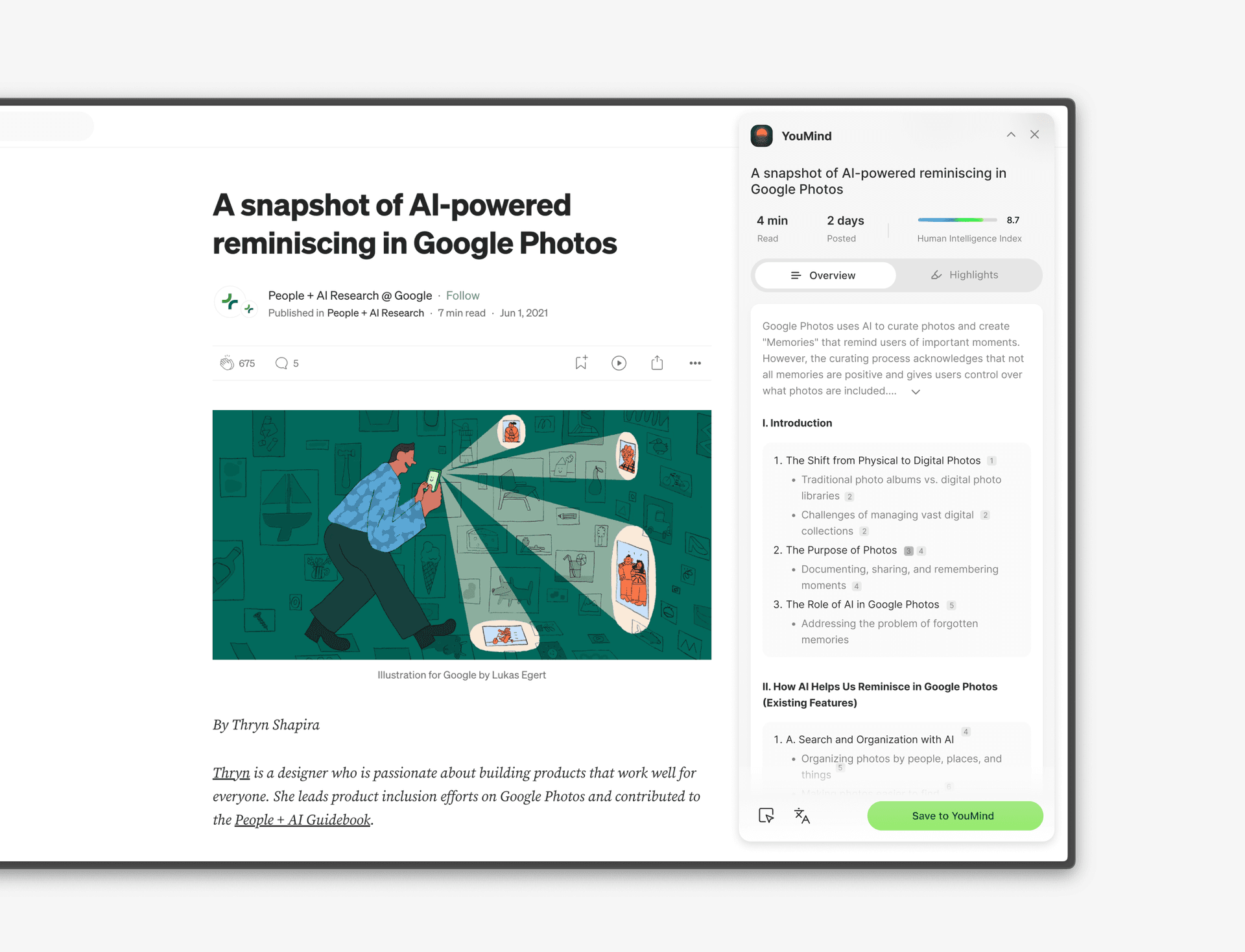
As for why we started with green, that's simple: I liked it. Ha! Since Yuque, I've been the one signing off on green. I wanted the product to feel vibrant and energetic. But Yubo might've been less thrilled. One time he quietly told me, "Can we stop using green? It makes me feel like we're still stuck in the last product." So, alright then, we switched to black.
Once you set the tone for features and style, most of what follows tends to revolve around that foundation. YouMind's extension has always centered on one through line: reading assistance + saving materials. That's been true from the earliest sketches to the current design.
Of course, you never saw this version in the official extension. After this phase wrapped, YouMind officially launched as a product, we built out the team, and we brought some new thinking into the mix.
Big Ideas in a Small Space
Before 0.1, the extension was pretty restrained because it had one focused job: reading assistance and saving materials. But once we launched the SaaS version, we quickly realized we wanted to do more.
For a while, we wanted to cram everything into the extension. The feature layout kept shifting around in that limited space. Keep in mind, fitting complex functionality into such a tiny area, while also accommodating features that aren't necessarily related, is genuinely challenging.
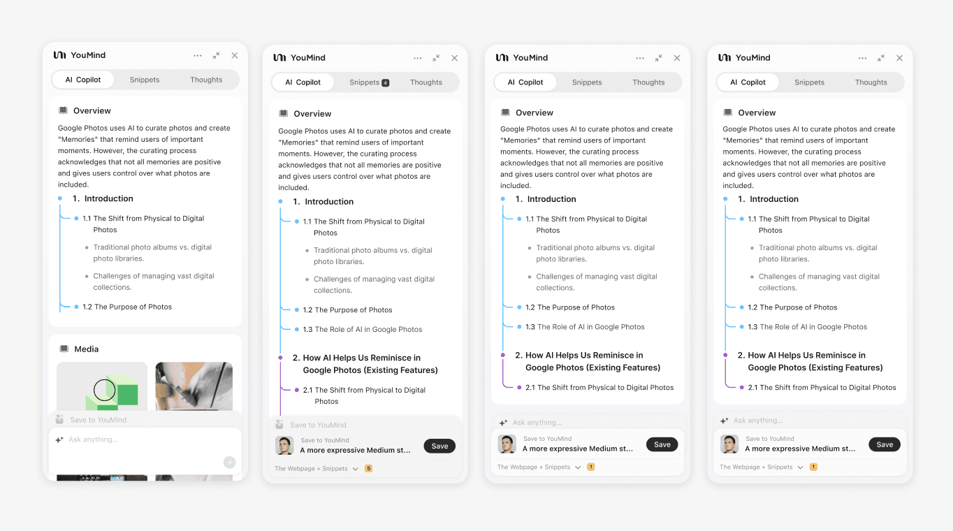
Back then, we wanted to add all sorts of things: AI Copilot, Snippet, Thoughts, Media, Overview, Save, and more. The problem was, once the framework stabilized a bit, these features all competed for attention. Each one wanted to be the star, the first thing users saw when they opened the extension.
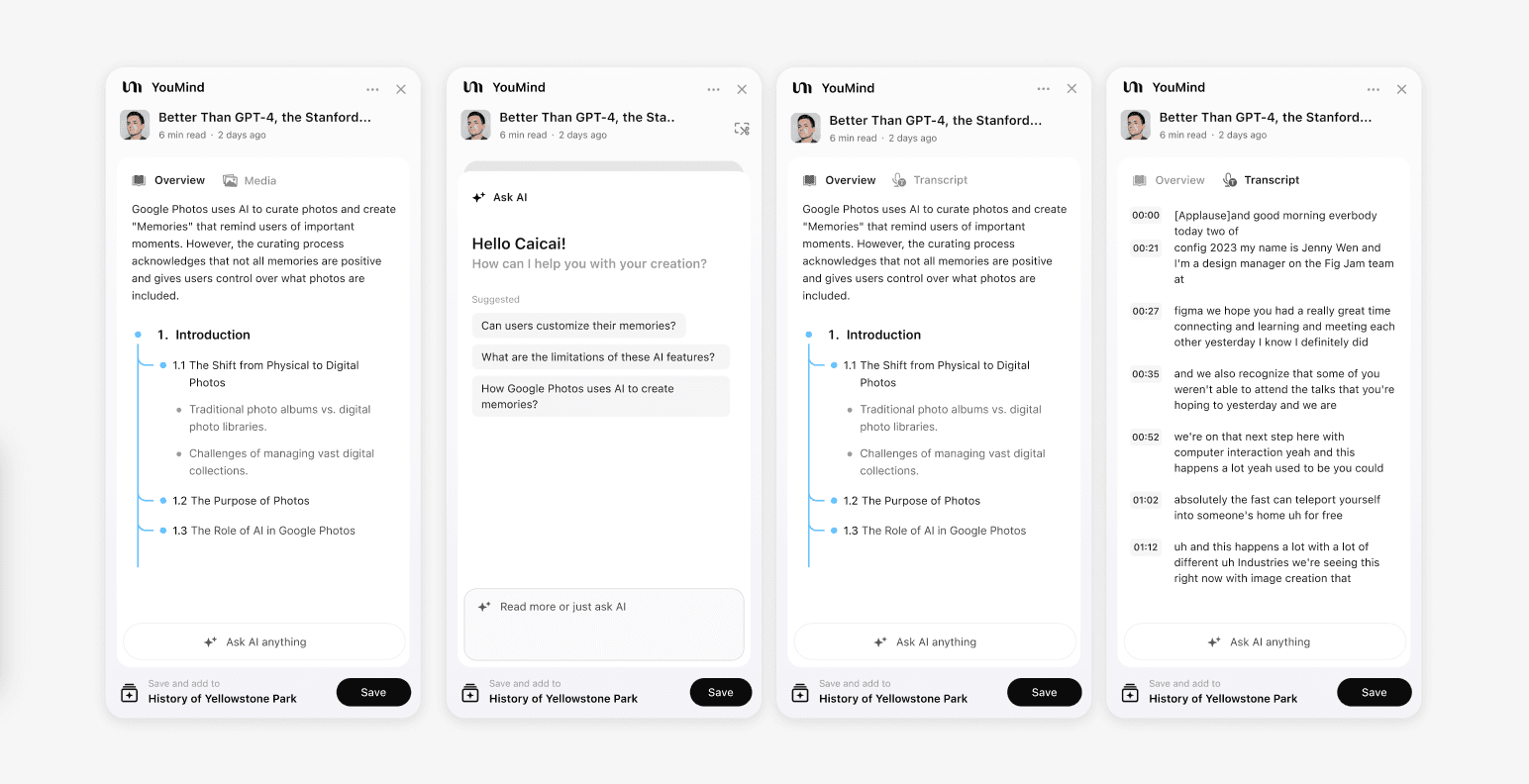
More importantly, Overview and Chat weren't originally two states of the same capability. They were separate features. Overview was a specialized summarization tool for specific scenarios, while Chat offered freeform conversation. To make both features immediately accessible, we went through countless layout iterations before settling on a compromise. That compromise became the foundation for version 0.2, and many subsequent capabilities evolved from there.
Just looking at a few design mockups, it's hard to grasp the full complexity. Let me add some context about the product logic we were dealing with:
- The YouMind extension tracks whether a page is "saved" or "not saved"
- For parseable pages, the extension automatically shows Overview
- Different content types (like YouTube) get specialized features for that context
- Overview wasn't technically part of AI Chat—it was a separate, custom AI capability
- We wanted users to be able to trigger AI Chat instantly in any situation
- ...
There were tons of foundational rules like these. For a product, the real challenge isn't just having lots of features. It's making sure all those conditional statements work together without conflicting, while still feeling natural in different contexts.
Some people criticized us at this point, saying we were trying to do too much, that we were running out of room for all these features. Looking back, they were absolutely right. For this initial 0.2 phase, we were definitely biting off more than we could chew. And the biggest issue was that in all this ambition, I'd kind of lost sight of the extension's original mission: reading assistance and Save.
So we kept adjusting and refining, making tradeoffs until we finally landed on a more lightweight, well-balanced version 0.2.
Limitations Drive Innovation
We ran version 0.2 for a full year. Starting from a single user and eventually reaching over 10,000, version 0.2 proved that all those early design debates and refinements were worthwhile.
While 0.2 could definitely carry the load, we also discovered limitations from those design decisions. Here are some typical and interesting questions users asked:
- Why does YouMind's extension always open Overview? Sometimes I just want to quietly save content
- Those little tools you added are hidden away. I used it for ages before discovering they existed
- Your Ask AI looks like a custom version just for the extension, different from the SaaS site
- Why do some new features on the SaaS site not sync to the extension?
These questions came from community users who were genuinely curious: these capabilities don't seem that complex, so why haven't they shown up in the extension?
The key issue was that with version 0.2, we'd already maxed out the space utilization. To adjust features without changing the existing structure, especially touching core framework elements, would be extremely costly. What made it worse was that we didn't want to just shove features wherever they'd fit. We always tried to think about where they "should" naturally appear.
Objectively speaking, YouMind's extension isn't poorly designed compared to what's in the Chrome store. But when these issues kept cropping up, we knew it was time to seriously consider version 0.3.
Based on the issues we'd identified, we quickly sketched out a basic draft.
Overall, there were a few clear shifts in thinking:
- Simplify the interface as much as possible, cut the bells and whistles, and dedicate more space to actual functionality
- Make interactions clearer so users understand exactly what they're doing at any given moment
- Give the extension its own framework that inherits SaaS characteristics while leaving room for future expansion
- Make the overall interface more stylish and modern, but not just "cool" for cool's sake
- And beneath all these changes, bring the core operation back to Save
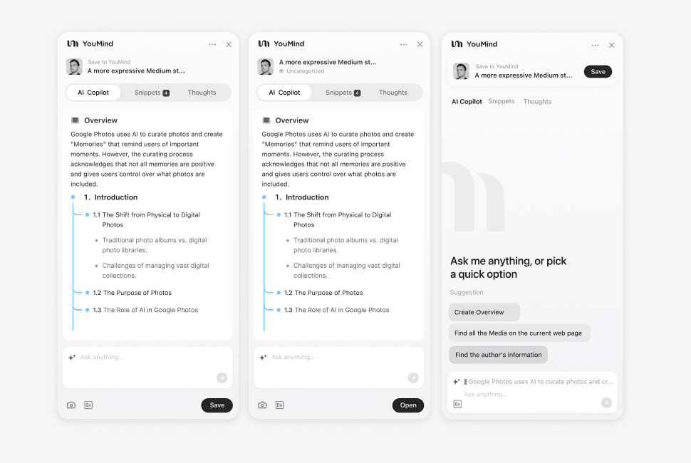
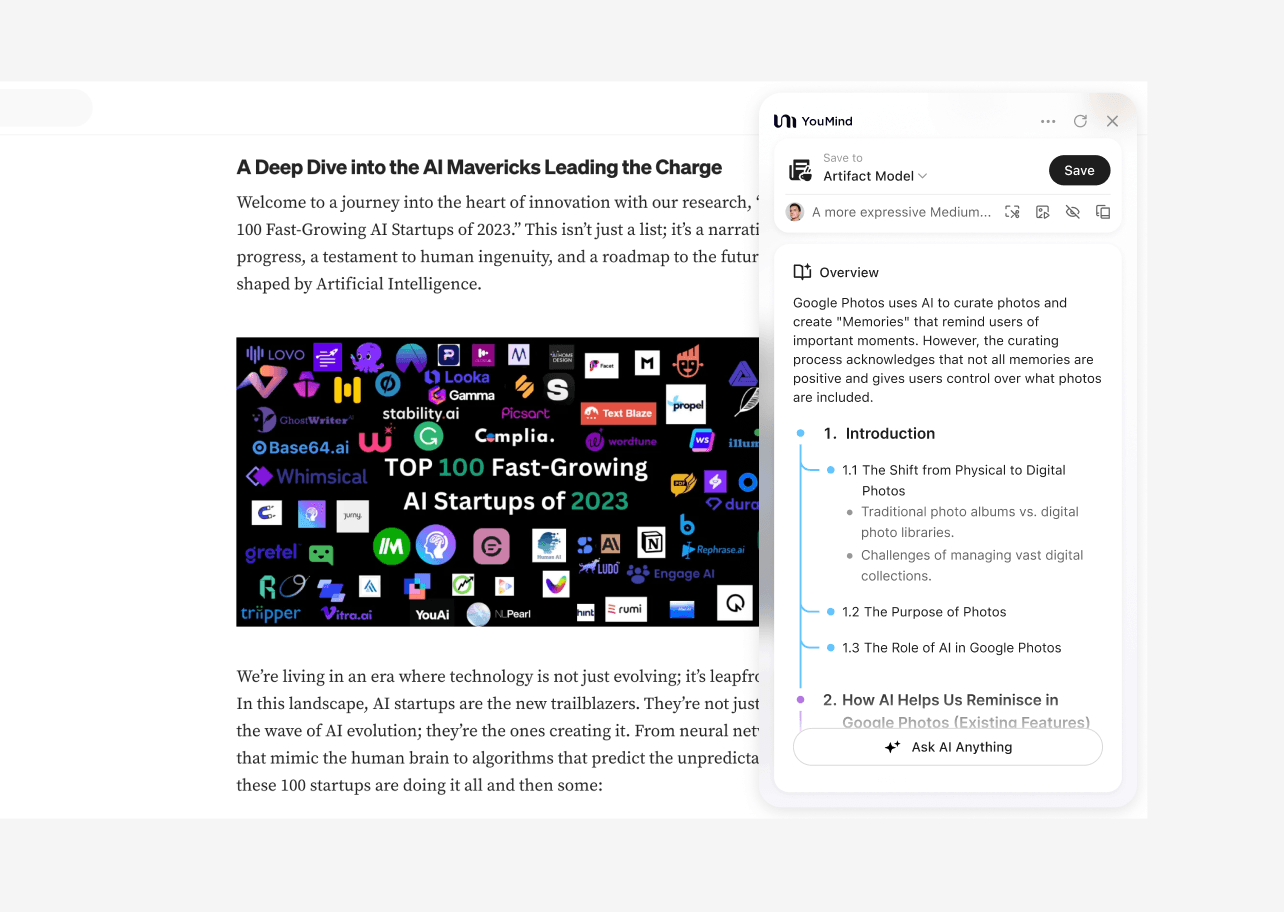
Based on this thinking, we iterated toward version 0.3's overall product design. You'll notice one very obvious change: when users first open it, they need to select a Board. This makes the Save process feel more natural and easier to understand.
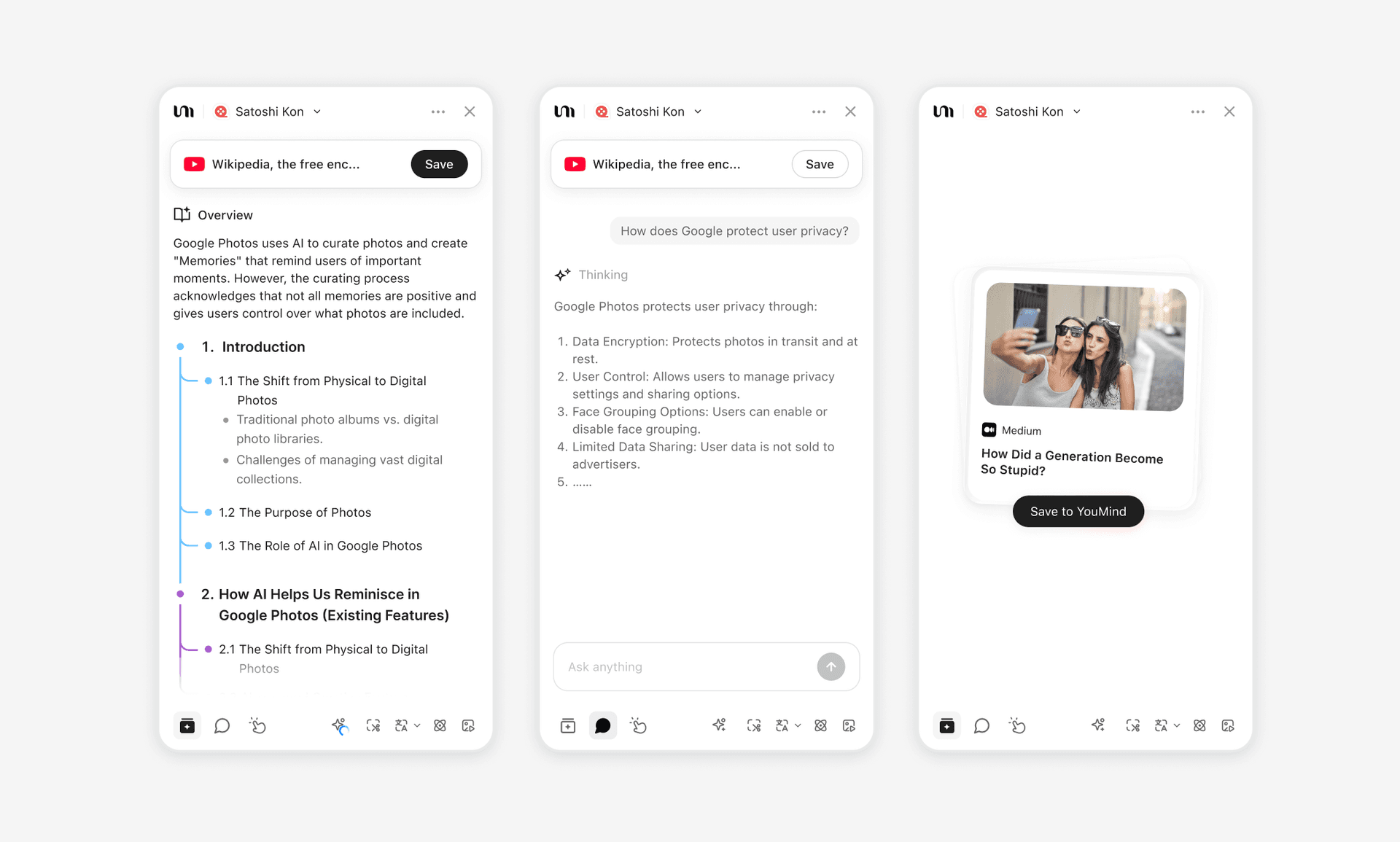
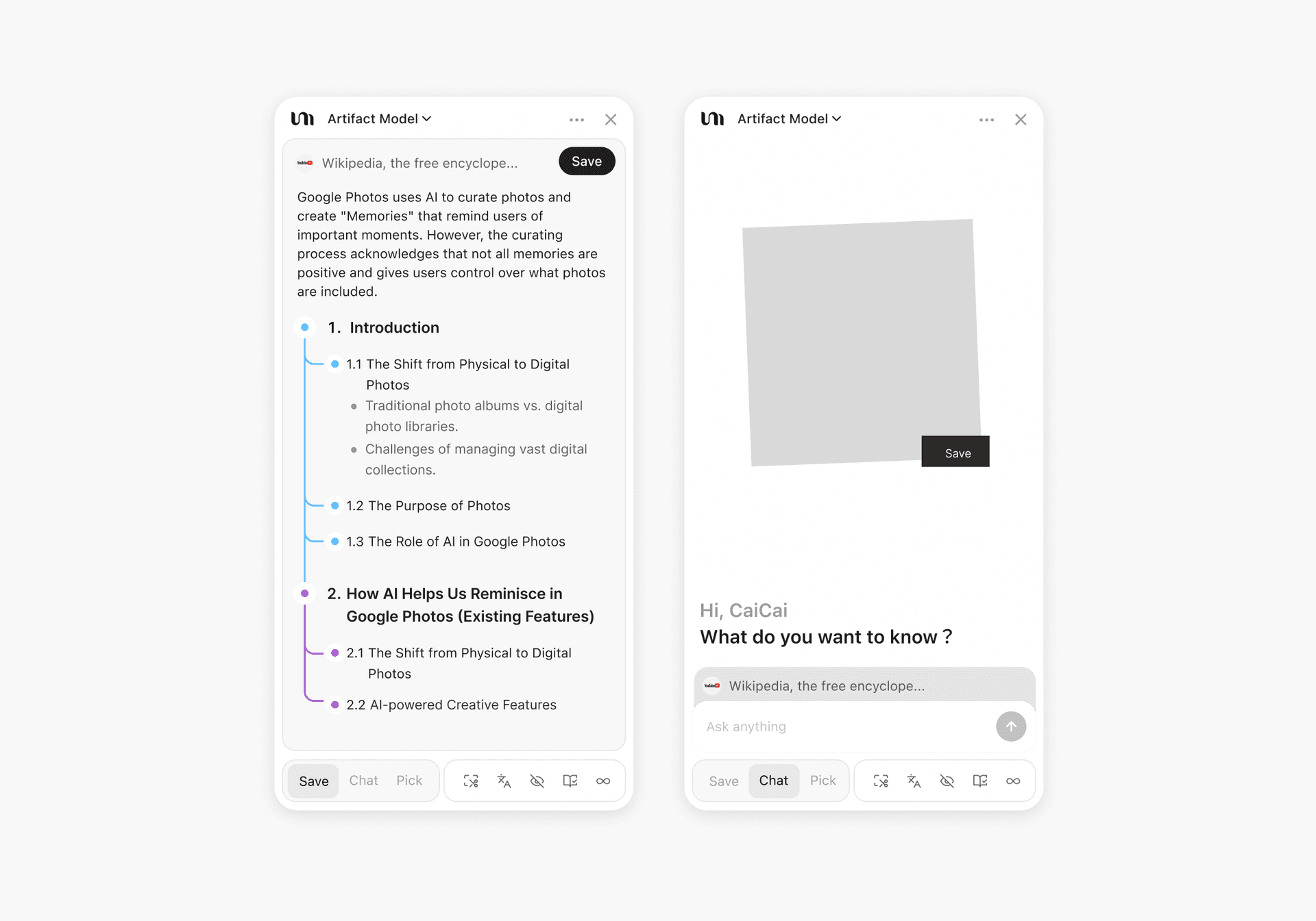
At the same time, Overview can now be turned off. When disabled, users can just use the Save functionality. Chat and Picks in the extension now pull from the same capabilities on the SaaS site, so the experience no longer feels fragmented. To the right of these main features, we added a tools section with translation, clipping, speed reading, and more, bringing them together in one clear location.
Another crucial addition: in the new extension version, we introduced a quick-access widget in the bottom right corner of pages. You can quickly save, chat with AI, or translate with one click.
The core idea behind this design is that when you don't want to open the full extension panel, you still have a lightweight entry point for the most common, frequent tasks. It exists to help with reading assistance and saving materials without disrupting your reading flow.
To Be Continued
The extension's story goes far beyond this, but writing this, I'm suddenly reminded of that afternoon with Yubo at the coffee in Tianmu. Back then, we stared at that narrow strip of browser space, full of ideas. Now, looking back, some of those ideas came to life, some were abandoned, and some are still in progress.
But the core mission hasn't changed: help users capture key information more efficiently while reading. That's where YouMind began, and that's the direction we'll keep pursuing.